
As Flimp Communications' first in-house designer, I was hired specifically to design explainer video storyboards. Fortunately, in start-ups, you can craft your own roles. I saw the need to truly define and refresh the Flimp brand in all of our client-facing collateral, web presence, and internal materials. So, I took it upon myself to embark in this project.
I wanted to achieve visual consistency and recognition across the board, while also "practicing what we preach," by applying the clear, concise, and engaging communications we use with our clients to facilitate interactions and streamline internal processes.
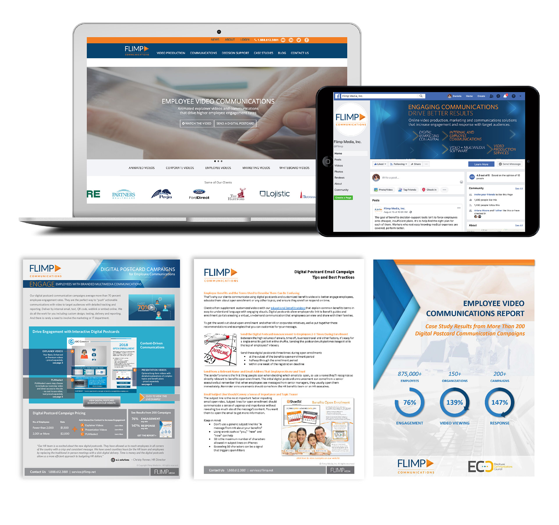
Here's a peak at the previous materials in use at Flimp:
The rebrand leveraged the existing assets (logo, color palette) and introduced new graphic elements, iconography, illustrations and layouts all inspired by the "arrow" in the logo as a unifying element.